Kyrill cont’d
In the first part, I talked about a preposterous hunch developing in my head. Could there be intent behind the building’s modernist stealthiness and its Byzantine circulation?

Down there in the pit on track one, at the brushed-steel base of one of the station’s shiny panorama elevators, I felt a longing growing in me to escape the suffocating grip of this building. I gazed up shiney glass shafts towards the clear autumn sky. I wished this station gone; wished it would disappear in a flash of blue-white light and the silent thump of an imploding light bulb. I wanted to find myself at the base of a conic void left by its implosion, surrounded by soft undulating dunes of Brandenburg’s Pleistocene sands.

I made it collapse into my cranium in millions of jittery, mechanical folds to metallic hisses and swooshes. Pheeacch, shwing, kssss. By pure thought, I had dematerialized this soulless mongrel in an act of pure desperation, into a single point of infinite mass. Unfortunately, it had lodged itself between the halves of my brain and made me feel not to so good. A prolonged stare into a halo of fluorescent light had bleached a patch of black on my retina, onto which an inner eye had cast these phantasmorgic projections. Fluerescent bulbs placed in recesses where the large concrete supports met slab, created the impression of daylight filtering down into the station’s lower levels. The architect had intended for this to be real daylight – capitals of daylight.

All around I felt cheated. Kyrill had exposed the station’s heroic tectonics as partial appliqué. My experience trying to get to trains after arsonist attacks had exposed the building’s dysfunctionality as a train station. The inefficiency of the circulation gelled the station’s free flowing spaces into a viscous space-time goo – the nectar of carnivorous plants – that I had to transcend in order to find my train. The building’s appearance and image denoted functionalism. It had lured me into an unsuspecting assumption of being in an efficient train station, when, in fact, I was trapped in an ingenious apparatus designed to maximize my exposure to its hideous merchandise and foods full of fillers.
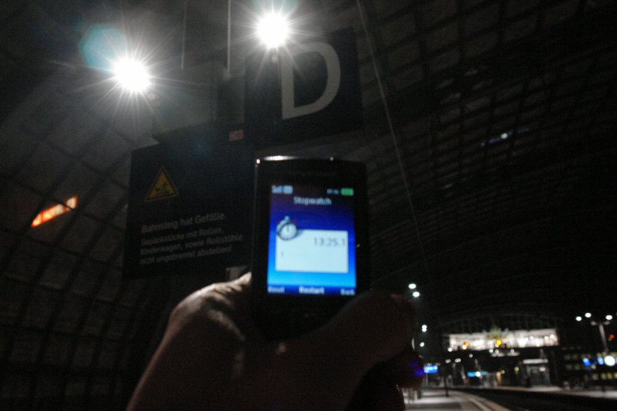
This time, it had gone to far. I set off again on another day to test my hypothesis. I retraced my attempts to switch trains, timing how long it took to complete the journey from one mainline route to the other. I studied the departure tables. Mainline trains arrived on the lower level’s outermost tracks, at the largest possible distance from the east west mainline routes on the stations uppermost levels. These tracks were all served by a single elevator. The lower level’s central platforms are intended mostly for local trains, yet are served by four panorama elevators each. Travel time from track 7 (North-South route), section C, to track 12 (East-West), section D: 13.5 minutes. Changed elevators thrice.
By the sobre sans-serif of this elevator sign that connotes clarity, you might think that this elevator serves tracks 11-16, or the exit, but it doesn’t. It’s saying “change on UG1 to catch another elevator to the EG where the exit is, or, alternatively, change on UG1 to catch an elevator to OG1 to find a Panorama elevator to track 16”, for example. If you’re French or English-speaking you might wonder what the exclamations OG!, UG!, EG! mean.

I hope you’ve memorized the shorthand as this is what the buttons look like in the elevators:

It does get weirder. On the stations uppermost level on track 15, an elevator sign points upward into the sky to airborne tracks 5 and 6, which is perhaps where the Maglev was intended to depart:

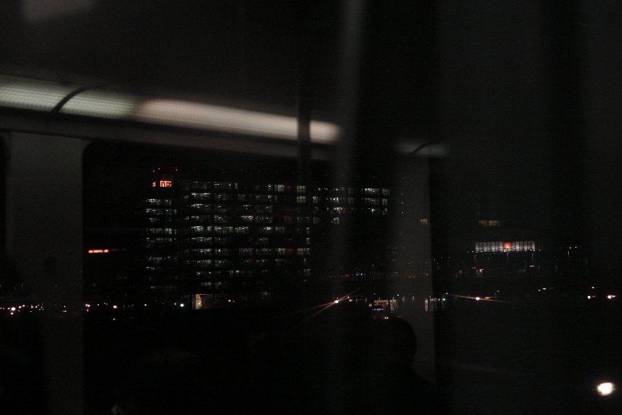
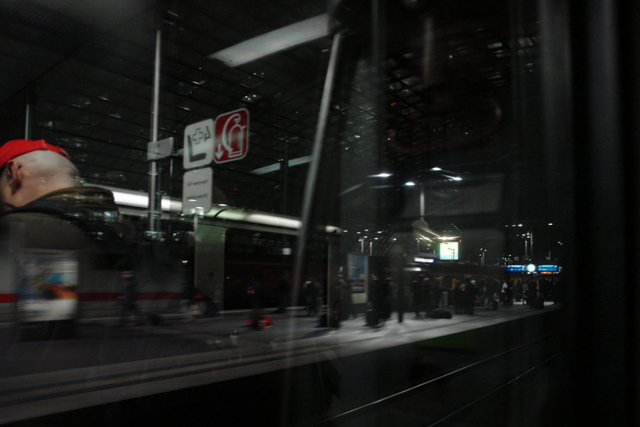
The station conspicuously lacks a focal point. Let’s meet under the ”¦ Hm. Where? There are no large clocks, no arrivals or departure boards, nothing that could help structure space by giving it hierarchy, or that could facilitate navigation in the station’s particular space-time. This absence turns our attention on the tubular panorama elevators, the station’s crown jewels. Carriages rise and descend like vertical pendulums in strange chronological units. Their flashiness connotes efficient circulation to us, leaving you at a loss as to why the heck they seem so slow. It must be your subjective perception of time or your nervousness. Wait a minute? No clocks? (There are clocks, but they seems strangely subdued and few are illuminated.)
 “
“
In many ways, train travel played a pivotal role in the rise of unified time. Trains were the first devices spanning various local time zones, each zone with their own approximation of time, initially based on sundials. This first unified time, necessitated by train schedules, was in fact called “railway time”.
“For example, Oxford Time was 5 minutes behind Greenwich Time, Leeds Time 6 minutes behind, Carnforth, 11 minutes behind, and Barrow almost 13 minutes behind. In India and North America these differences could be sixty minutes or more.”
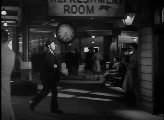
The British film classic Brief Encounter tells the story of two people falling in love after meeting at a train station. The station’s clock calls time on their last meeting in the station’s cafe before he emigrates to South Africa with his family. Image-Google Brief Encounter and chances are you will see an abundance of images displaying the clock of Carnforth railway station.
So it may be said that the fundamental structuring agent of the train station is time, and time’s architectural expression is the clock. More than just a purely functional device, the clock was a perfect way to create a sense of place by denoting time and schedule and train station. And it’s so atmospheric. The clock is to the train station what the tower is to the church, or to the airport. Yet, at Berlin’s central station, you have to look hard to find one. Clocks along the shopping concourses are, we suspect, deliberately not illuminated, in order to not distract from the shopping signage and also to aid in the general sense of disorientation, both in time and in space.
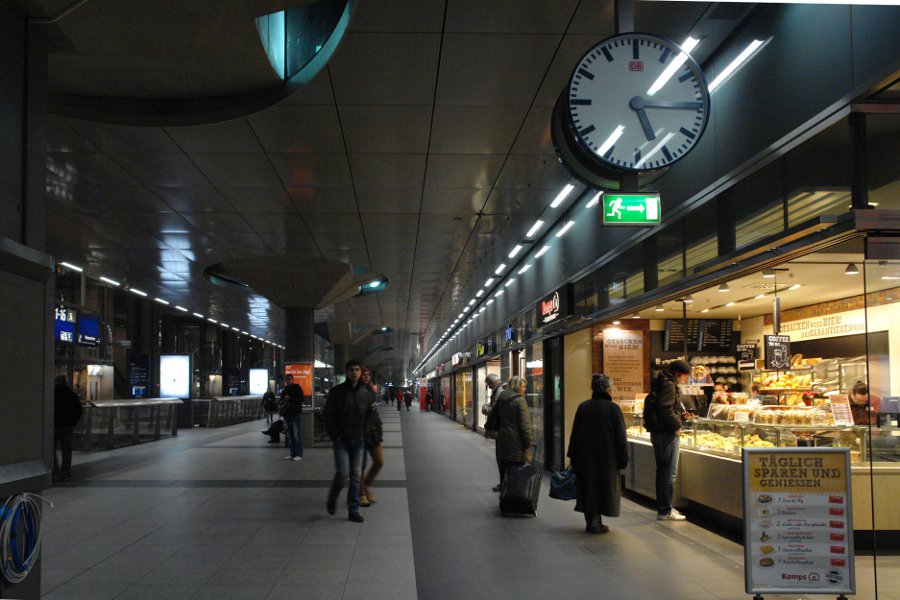
The architecture of the mall and its bastard cousin, the terminal, is the architecture of disorientation and hence no clocks, or clocks without illumination, or disproportionately small clocks. Clocks, or any other orientation devices, would only dispel the sort of manifold junk space in which the consumer gets lost and where she falls back onto a fundamental comfort strategy of practicing something that feels familiar: in light of the alienation and disorientation, of hoarding, of shopping. This is a shopping center and the two mainline routes are its anchor shops. The north-south route’s the Macy’s and the east-west is the Sears.
The glassy physiognomy of modernist architecture – its transparency, its reflective, and refractive qualities – does not serve modernist ideals, e.g. transparent democratic processes, reason, legibility, etc. Instead, it seems to serve its opposites. The modernist materiality scatters commercial signage and lighting and space, throwing it all back at us in myriad, kaleidoscopic reflections that add to the sense of drowning in a flood of commercial semiotics.
The building’s other pièce de résistance is its vaulted glass and steel roof. It is strangely underlit at night, much to the benefit and legibility of the revenue-generating light displays by “Datev” and “Bombardier”. Along the concourses, lighting is carefully controlled to highlight shops and restaurants. Circulation signage is mute, while commercial signage is loud.
