Kern baby, kern!
The article “Fubar Corner“, from April of this year, was one of our regular skirmishes against what we perceive to be an affront to the architectural arts, just as much as it is a contribution. Today we must shed light on a further affront made by the same building, but this time to the typographic arts.
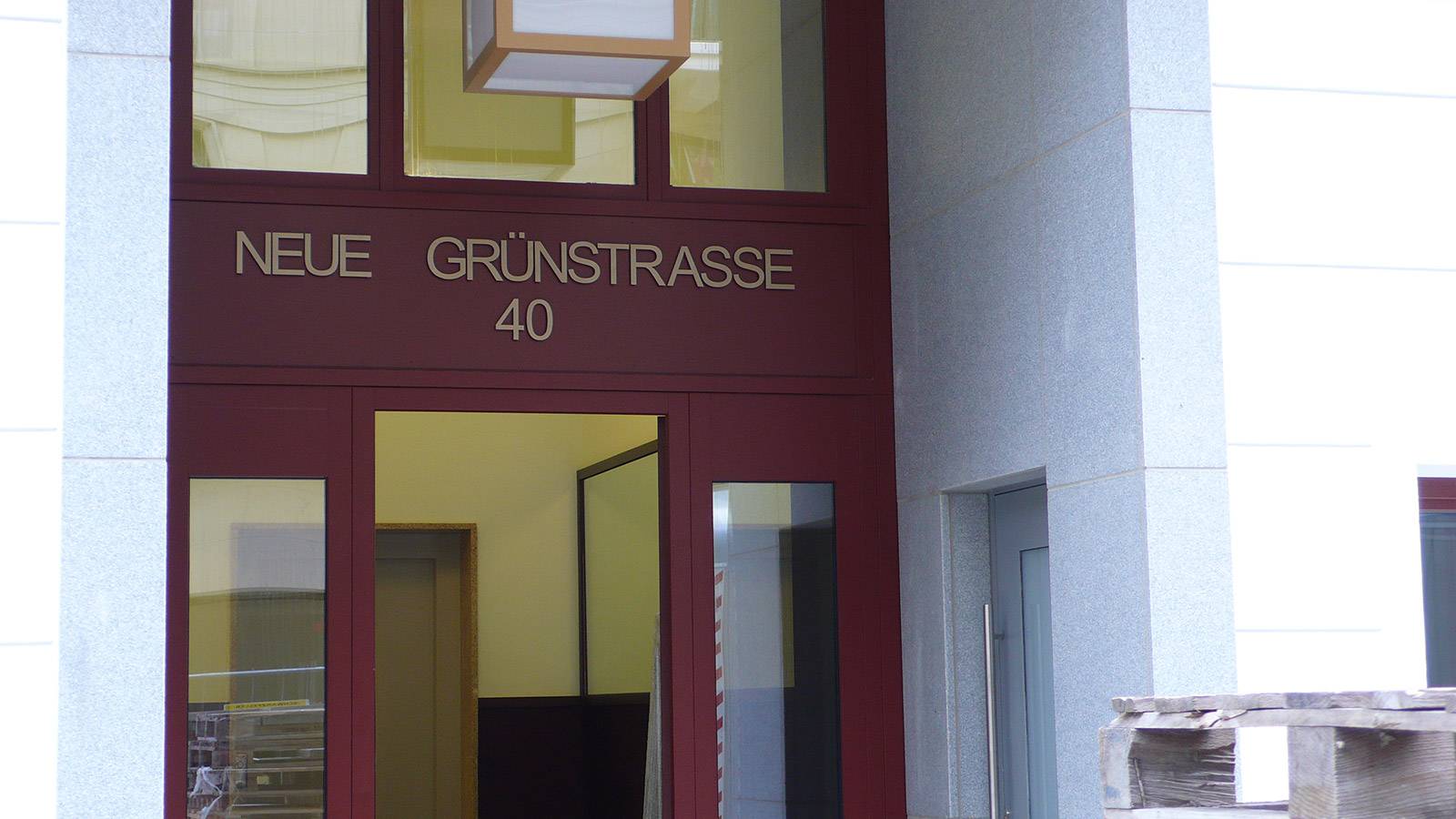
The object in question is Neue Grünstraße 40, otherwise known as ‘Berliner Neue Mitte’ by its developers, the Munich-based Baywobau. A quick peruse of the relevant project page of their website reveals that the horrid, wine-red, polyurethane window bay we criticised was actually planned by the architects as being constructed of wood.
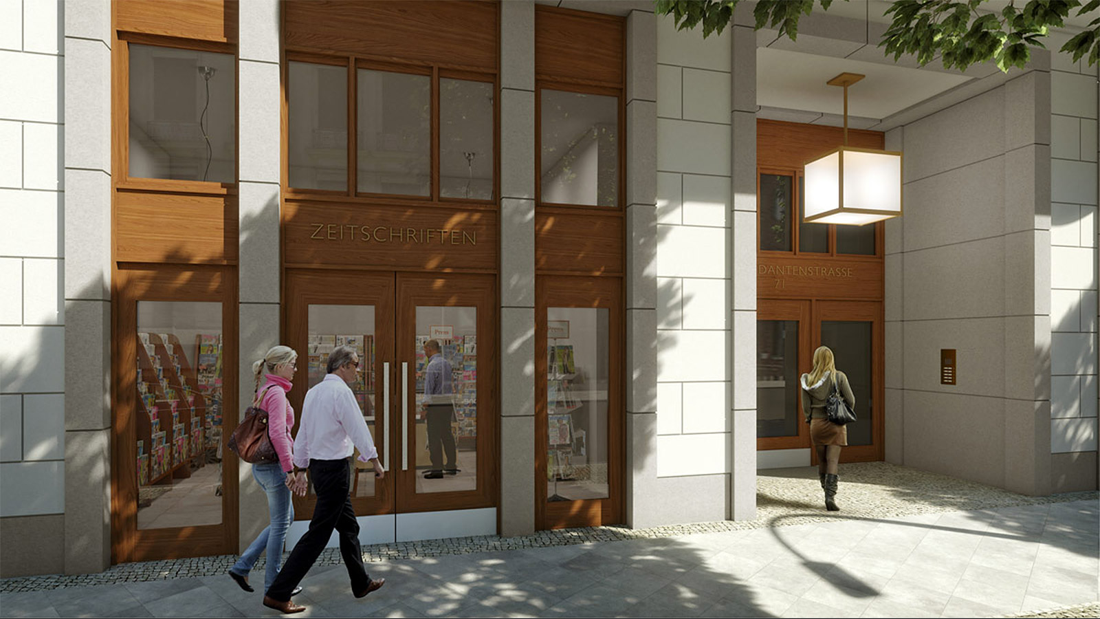
Click through their slideshow (skipping over the inexplicable photo of a park bench on Unter den Linden, 2km distant) or peer closely at the rendering above, and one can see that the architects did a pretty good job on the typography over the doorways: Paul Renner’s 1927 typeface Futura has been used, and the letters are well-spaced. In reality though, the building will have to put up with Arial, which has been applied in the most ham-fisted way imaginable. The letters are mercilessly crushed up against each other, leaving a gaping hole between the words and tipping the whole center-justified affair completely off balance.
As a flourish, or a signing-off, the lettering probably marked the finishing touch to the entire building. How tragic, and how typical, that this final simple gesture should have been executed so poorly.