The Graphics of Extinction

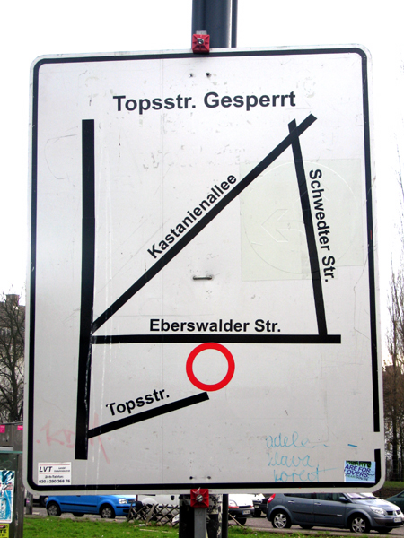
I was taken by the matter-of-fact look of this, a map provided for drivers who would otherwise try to take a short cut around the big Schönhauerseralle / Eberswalderstr / Kastanienalle / Danzigerstr / Pappelalle intersection in Berlin. Its the work of LVT Verkehrstechnik, based in Riesa, Sachsen (Germany).
The aesthetics of survival, it seems. This totally bare-bones look, meant only to communicate a set of relationships in the most diagrammatic manner, in a manner in which aesthetics are incidental.
But I wonder if it all doesn’t critically fail to actually help anyone understand anything. Like, where’s the location of the sign on the map, what does the circle signify, what’s the name of the street on the left hand side? And why’s the sign pointing directly out into the street instead of in the direction of oncoming traffic? Is the red circle the location of the road work? Shouldn’t it be an ‘X’?
I wonder if this sign actually helped anyone avoid driving down the blocked road.