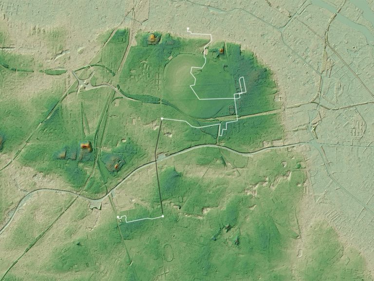
Deep Topography ∕ Erosion ∕ Walking
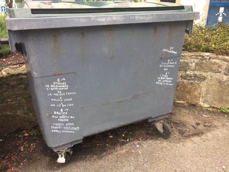
Appropriation ∕ Film ∕ Graffiti ∕ Public Space
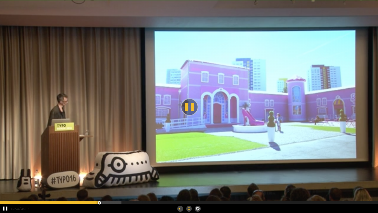
Archive ∕ Blurbanism ∕ Event ∕ Lecture ∕ Memory ∕ Personal History ∕ Shopping Malls ∕ Video
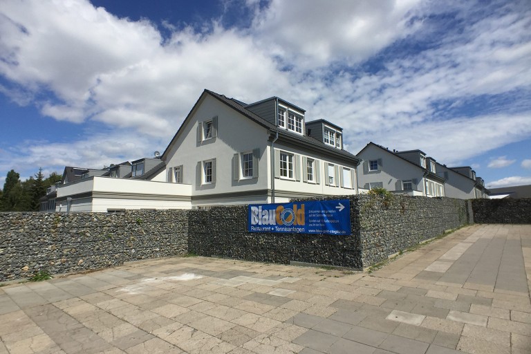
Appropriation ∕ Eurotrash ∕ Hardscape ∕ Military Urbanism ∕ Spatial Commodity
Archeosphere ∕ Cities ∕ Crisis ∕ Patageology ∕ Psychogeography ∕ Socio-Spatial Spasm ∕ Structural Collapse
Earth Junk ∕ Faux Nature ∕ Geology ∕ Nature ∕ Shopping Malls