Foooooftureproof Design
Pity this café in Rennes, France. They’ve gone for an interesting sign concept: large stencil font, unusual abbreviations, striking verticality, information abstracted and foregrounded. The final result is slightly complicated, but there is a spirit of simplicity that nevertheless survives. The verticalized phone number in the glass of the door picks up the vibe quite well.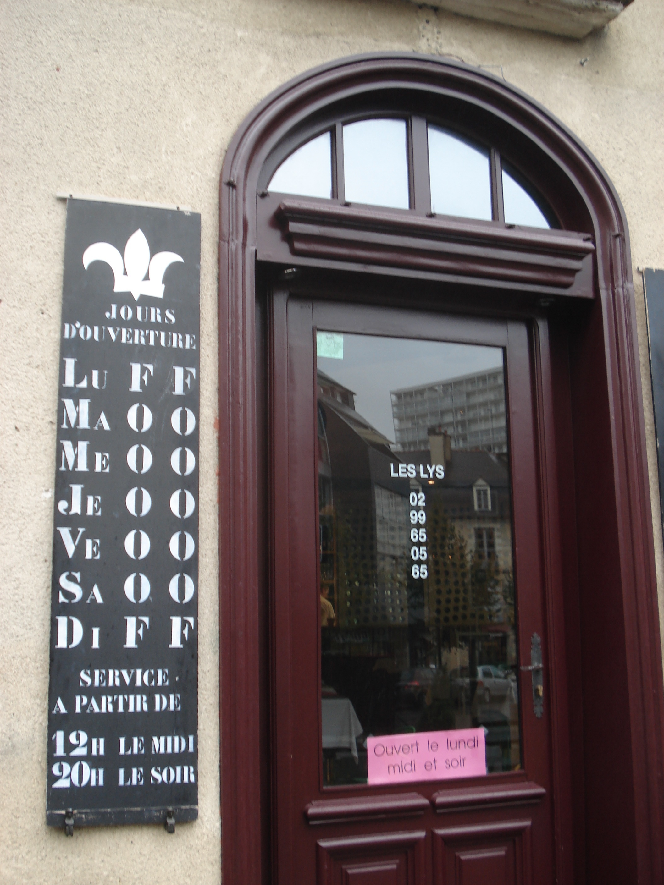
For those who don’t speak French: the vertical column on the left indicates days of the week. Reading across, there are two opening times per day, midday and evening. ‘Open’ in indicated by ‘O’ for ouvert, while ‘closed’ is indicated by ‘F’ for fermé. Odd quasi-locutions arise if we read each line across: Luff might be a German pronouncing ‘love’, Maoo might be a Chinese dictator, Meoo a truncated cat, Jeoo a member of the tribes of Israel, Veoo sounds like a cleaning product, Saoo feels Portuguese somehow, and as for Sunday, what’s the Diff? Reading downwards also yields unintended pleasures: Fooooof, Fooooof.
But we should pity the café not for these quirks, but for the expense laid out for a fancy-pants sign which cannot be adjusted to changing circumstances. What happens if they decide to open on Mondays after all? All they can do is stick a pink sign to the glass of the door (apologies for the photography), which reads ‘Open Mondays, midday and evening’. Doh!